In Her Element
Theatre Company
The Client & Brief: "In Her Element" required a sophisticated visual identity designed to convey strength, grace, and empowerment. The primary goal was to establish a brand mark that felt both fierce and grounded, appealing to an audience seeking personal growth, confidence, and authenticity. The key creative challenge was seamlessly merging organic, powerful imagery with high-contrast typography in a balanced, circular composition.
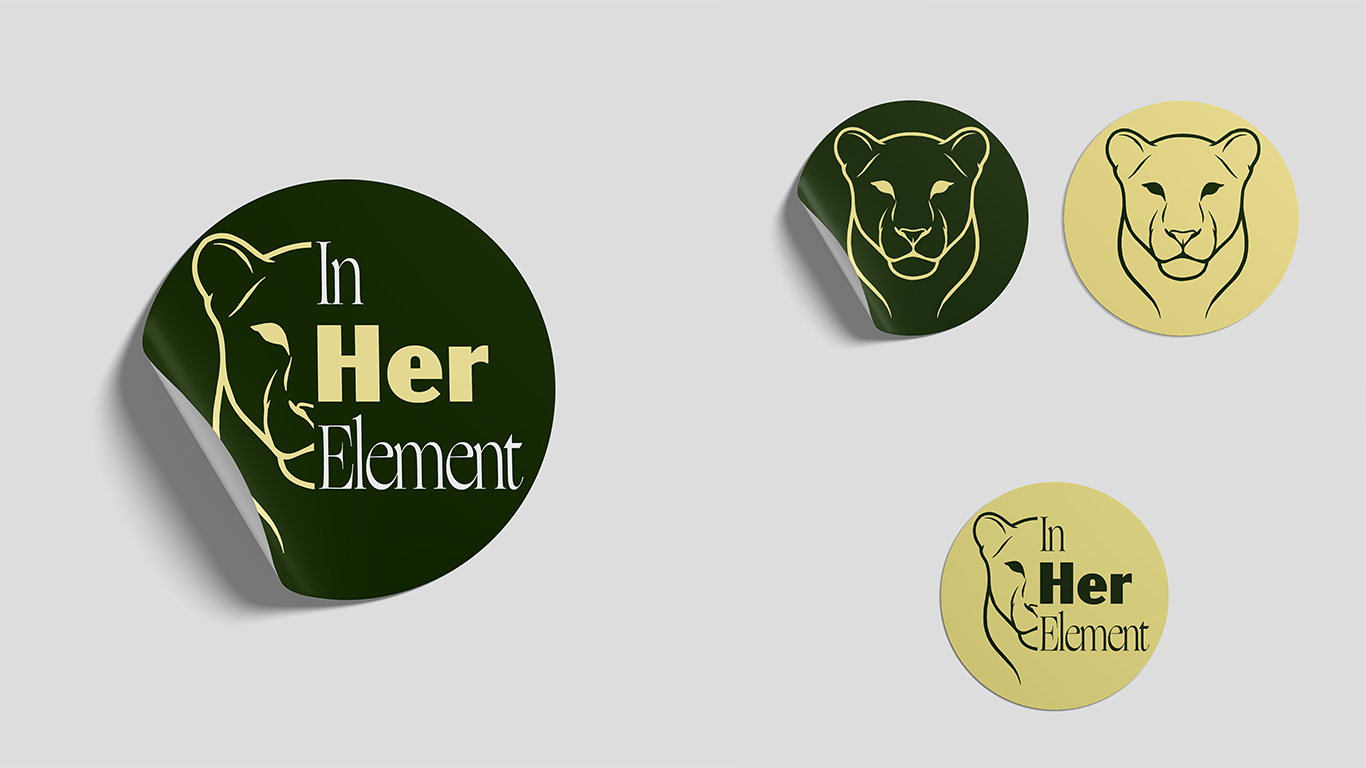
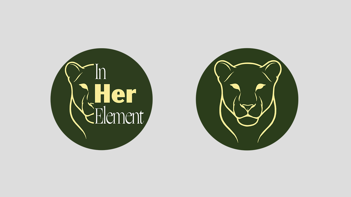
Design Evolution & Solution: The design centers on a line-art illustration of a lioness, split directly down the center to interact with the typography. By displaying only the left half of the face, the illustration invites the viewer's eye to complete the form, creating an engaging visual dynamic. The right side of the frame features stacked vertical text ("In Her Element"), where the word "Her" is rendered in a bold, solid weight to immediately draw focus to the core theme of female identity and strength. The surrounding words ("In" and "Element") utilize a refined, high-contrast serif font to introduce elegance and structure.
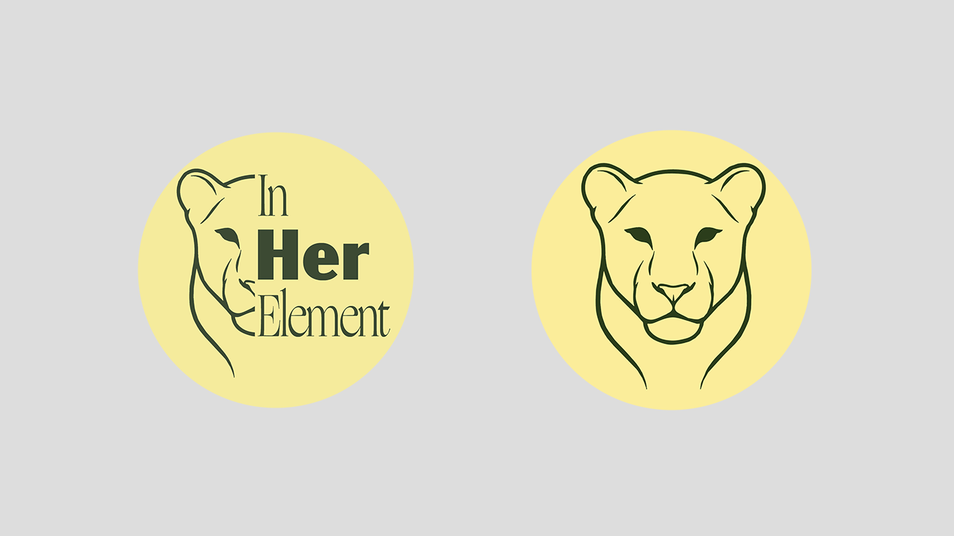
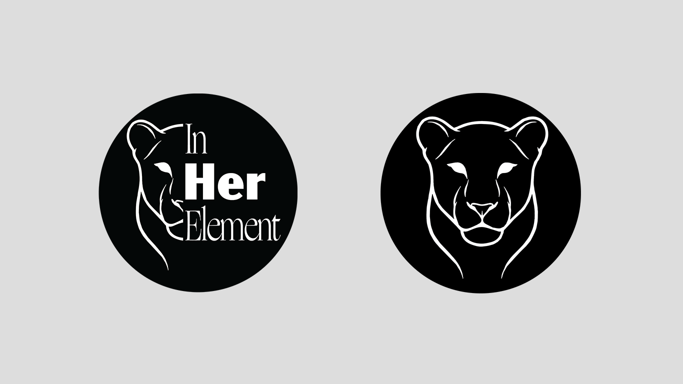
Typography & Colour: The contrast between the primary bold sans-serif ("Her") and the elegant serif typeface ("In" / "Element") creates an engaging visual hierarchy, balancing assertive strength with high-end sophistication. The brand uses a earthy, natural color palette centered around deep forest green and warm butter-yellow tones. The dark green establishes a sense of stability, growth, and nature, while the soft yellow delivers warm energy and readability. A monochrome black-and-white variant ensures total versatility across print and digital media.
Social Media & Brand Adaptations
The Adaptation Strategy: To maintain clarity across different visual channels and smaller profile icon sizes, the primary logo was decoupled into dedicated secondary marks. These variations strip away the complex typography to highlight the lioness illustration as a standalone brand symbol.
Key Changes:
Standalone Brand Marks (Logo Marks 1 & 2): The full lioness face is restored into a symmetrical icon, removing all text to maximize legibility at micro-scales (e.g., Instagram avatars, app icons, and favicons).
Color Inversion & Versatility: The icon leverages inverted color schemes (gold on forest green and dark green on pastel yellow) to allow flexible aesthetic usage across light and dark digital themes.
Monochrome Execution: The black-and-white circular badge retains the split-face design and typography layout, providing a high-contrast alternative optimized for single-color print, merchandise, or watermarks.