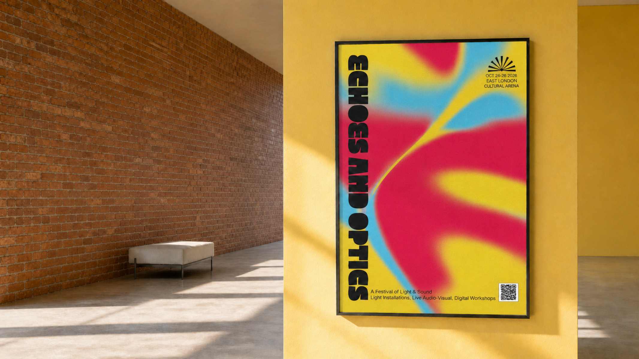
Echoes and Optics
Echoes & Optics — Festival Identity & Motion (Self-Initiated Concept Project):
1. The Brief
Echoes & Optics is an immersive festival bringing together light installations, live audio-visual sets, and digital workshops at the East London Cultural Arena. I set out to build a cohesive visual identity from scratch—taking the project from physical print and outdoor signage all the way to dynamic digital motion graphics within a tight timeframe.
The goal? Create a brand that feels alive, seamlessly bridging the gap between physical venue navigation and digital screens.
2. Color & Texture
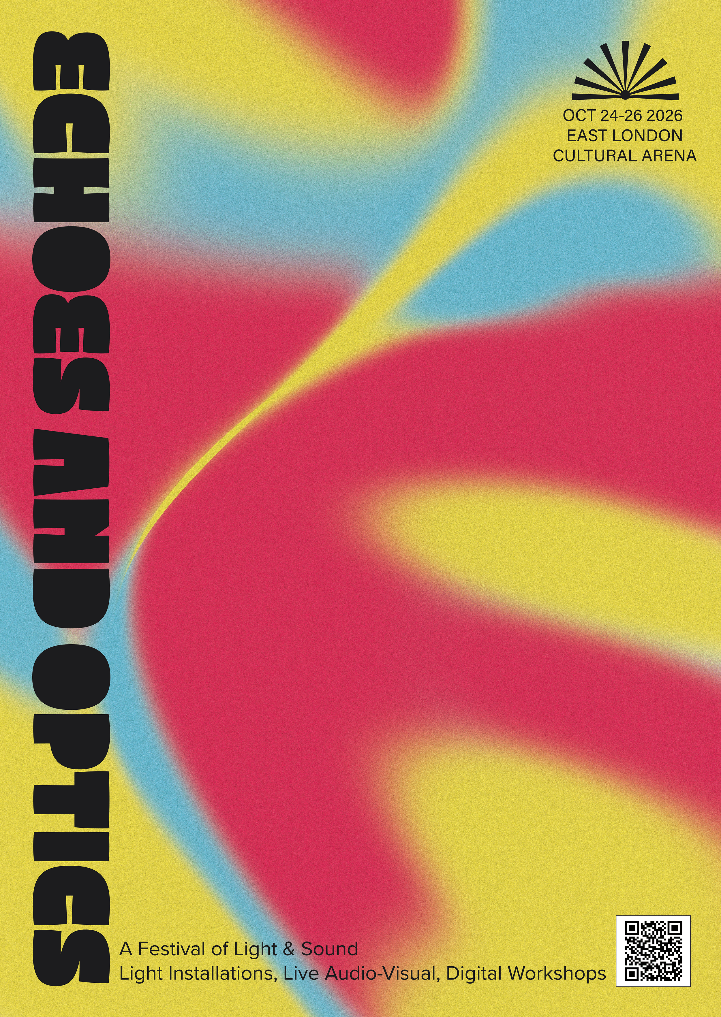
The brand revolves around a punchy, high-energy 4-colour fluid gradient: Electric Yellow, Bright Cyan, Vivid Magenta, and Deep Charcoal.
The Vibe: The smooth, swirling blending of bright primary colours represents light refraction (Optics) and sound waves (Echoes).
The Texture: I added a subtle grain across the backgrounds. It gives the bright digital gradients a tactile, premium feel in print and prevents color banding on screens.
Contrast: Dark charcoal elements and bold black blocks anchor the glowing backgrounds, keeping all key details super easy to read.
3. Typography
To balance artistic personality with clear function, I paired an expressive headline font with a clean, utilitarian sans-serif:
Headline Type (Macchia): Used for the main ECHOES AND OPTICS title. Its heavy, organic feel gives the festival a bold, experimental personality.
Body & Technical Type (Acumin Pro and Proxima Nova): Used for dates, stage numbers, and schedules. It keeps everything clean, accessible, and effortless to read from a distance.
4. Breaking Down the Assets
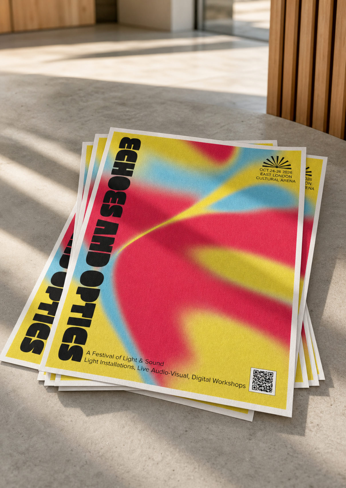
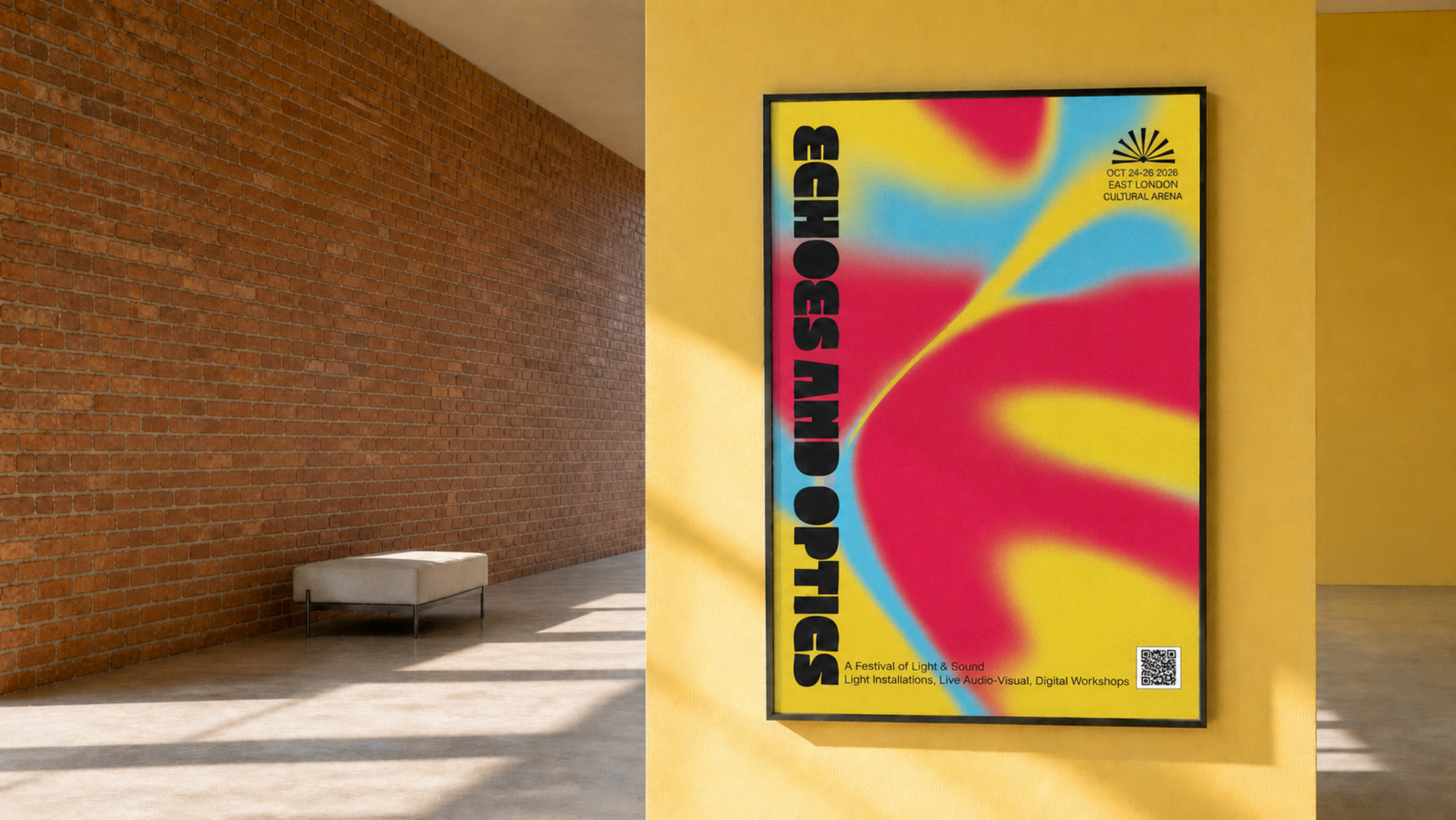
A1 Festival Poster
What it is: The main print promo piece.
The Design: The heavy vertical title locks down the left side to instantly grab attention. The top-right fan motif acts as a quick visual anchor, while festival details and a ticket QR code sit cleanly at the bottom for quick scanning on the street.
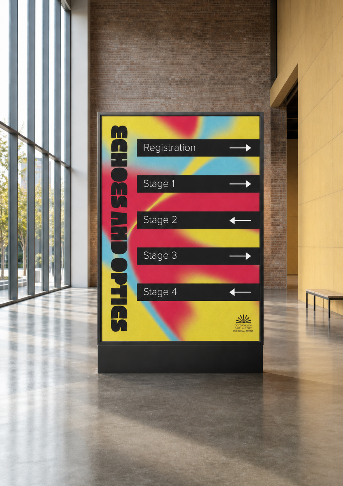
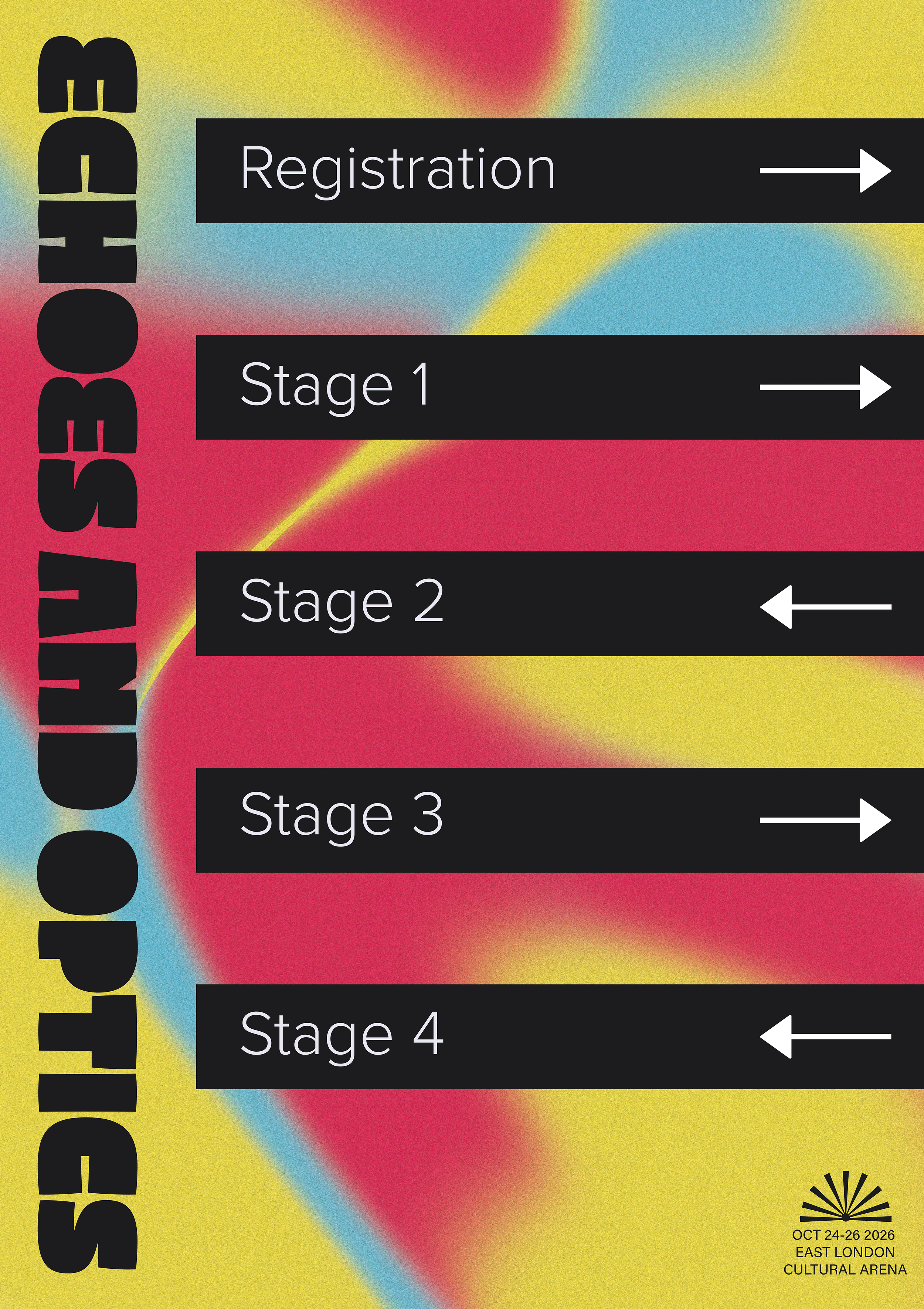
Wayfinding Signage
What it is: Directional boards for high-traffic gallery corridors.
The Design: Built for fast scanning on the move. I used solid charcoal directional blocks overlaid on the gradient background to make stage numbers (Stage 1–4, Registration) and arrows pop.
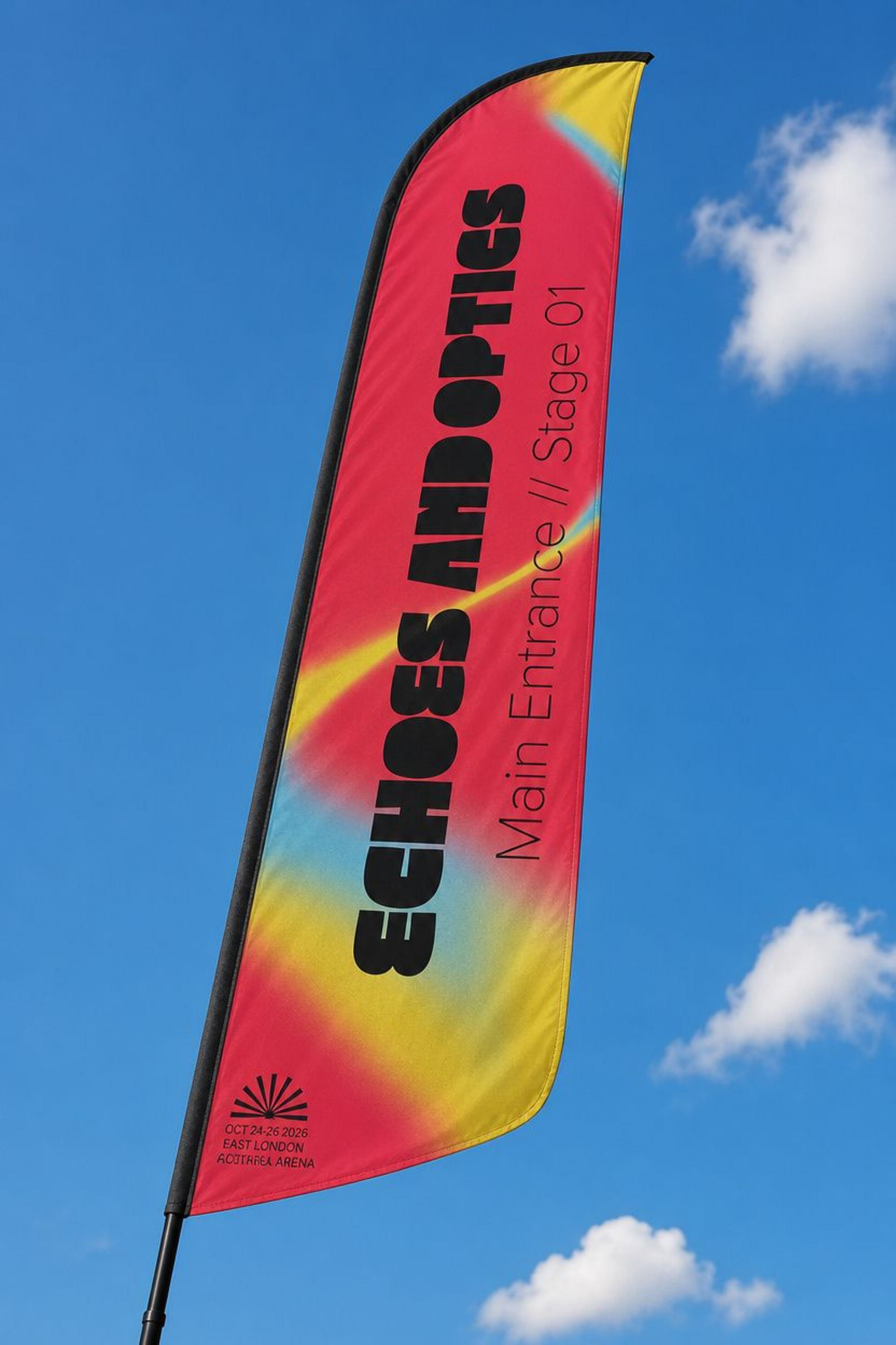
Entrance Signboard
What it is: The main landmark sign at the venue entrance.
The Design: A wide horizontal layout that pairs the bold brand title with thin, ultra-clean subtext (Main Entrance // Stage 01), helping visitors instantly confirm they're in the right spot as they walk in.
5-Second Motion Banner (1920px X 1080px)
What it is: Animated display screen banner and social asset.
The Design: I brought the static print gradient to life using After Effects math expressions, making the four colour points continuously swirl and drift past each other. The logo and event details fade in smoothly over top, connecting the print media to digital venue screens.