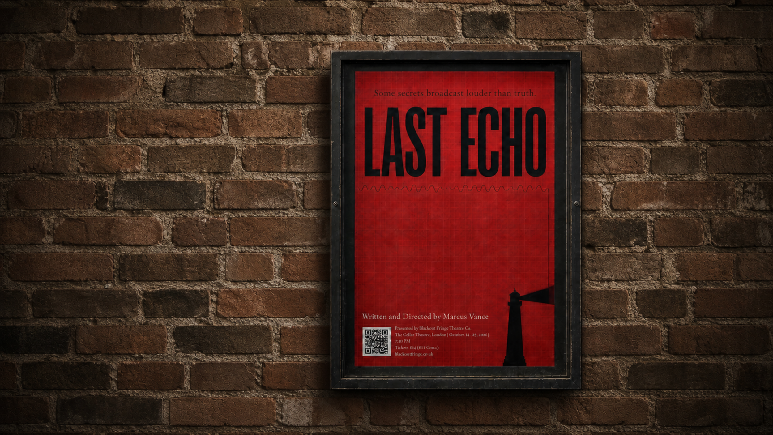
Last Echo
Brief & Overview (Self-Initiated Concept Project):
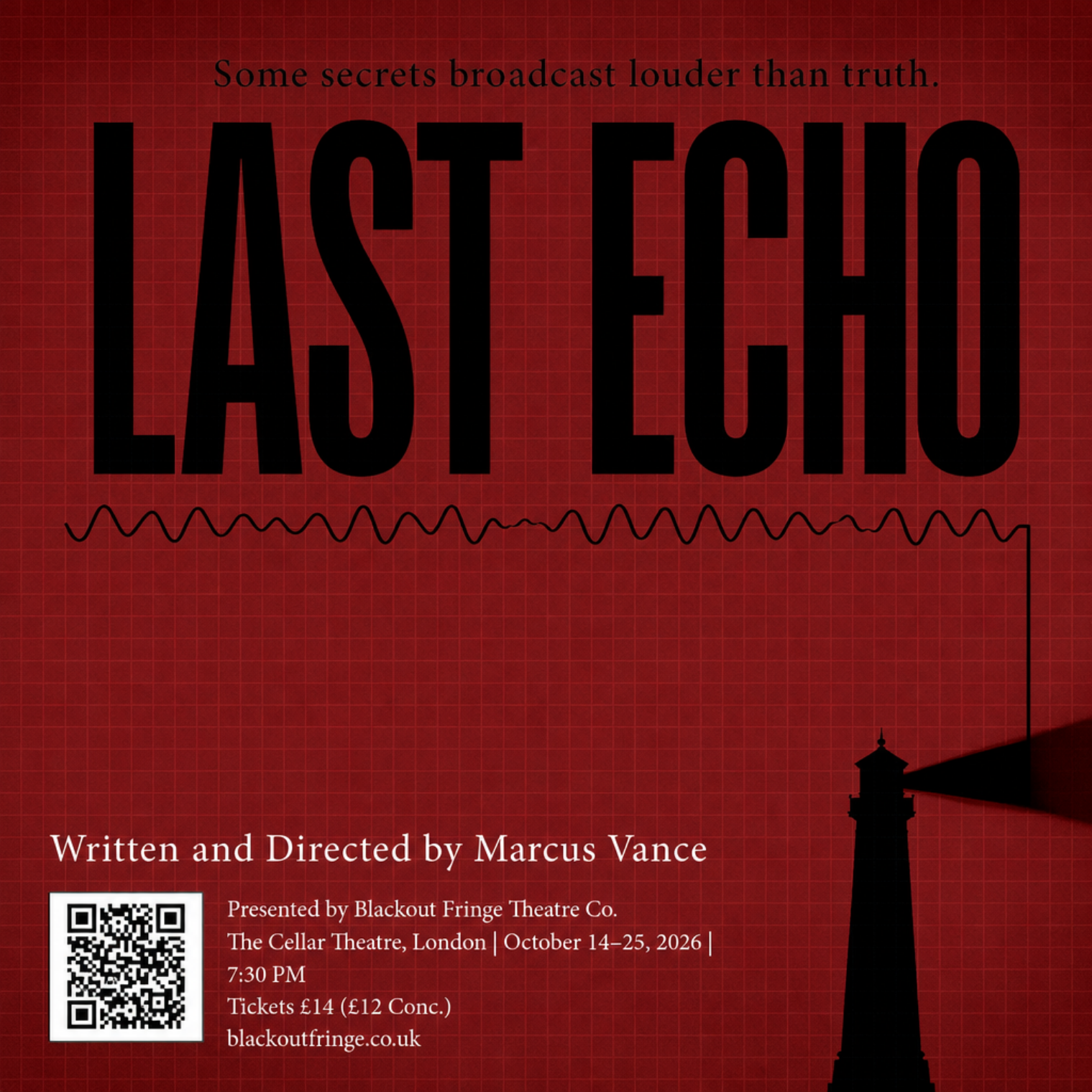
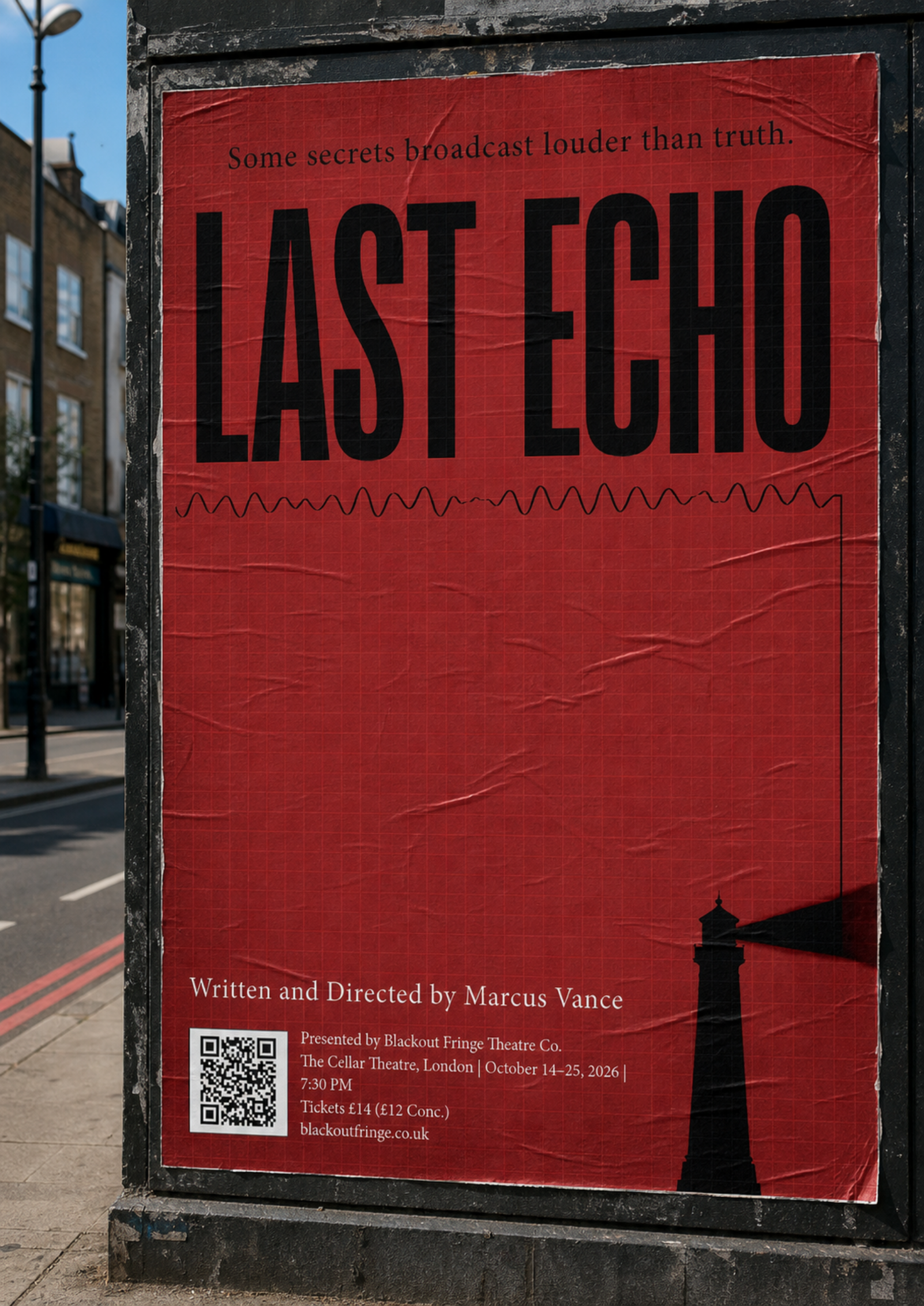
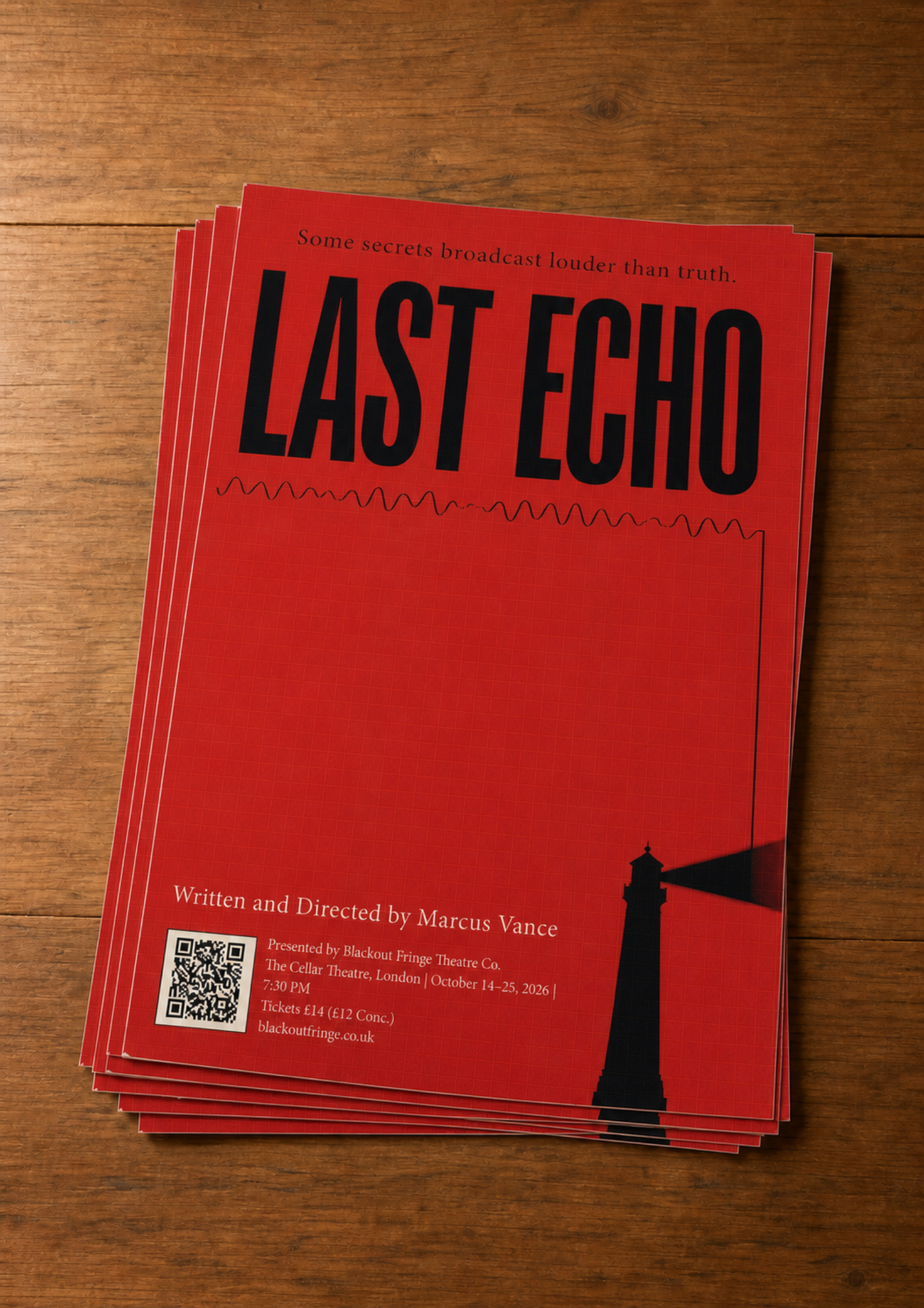
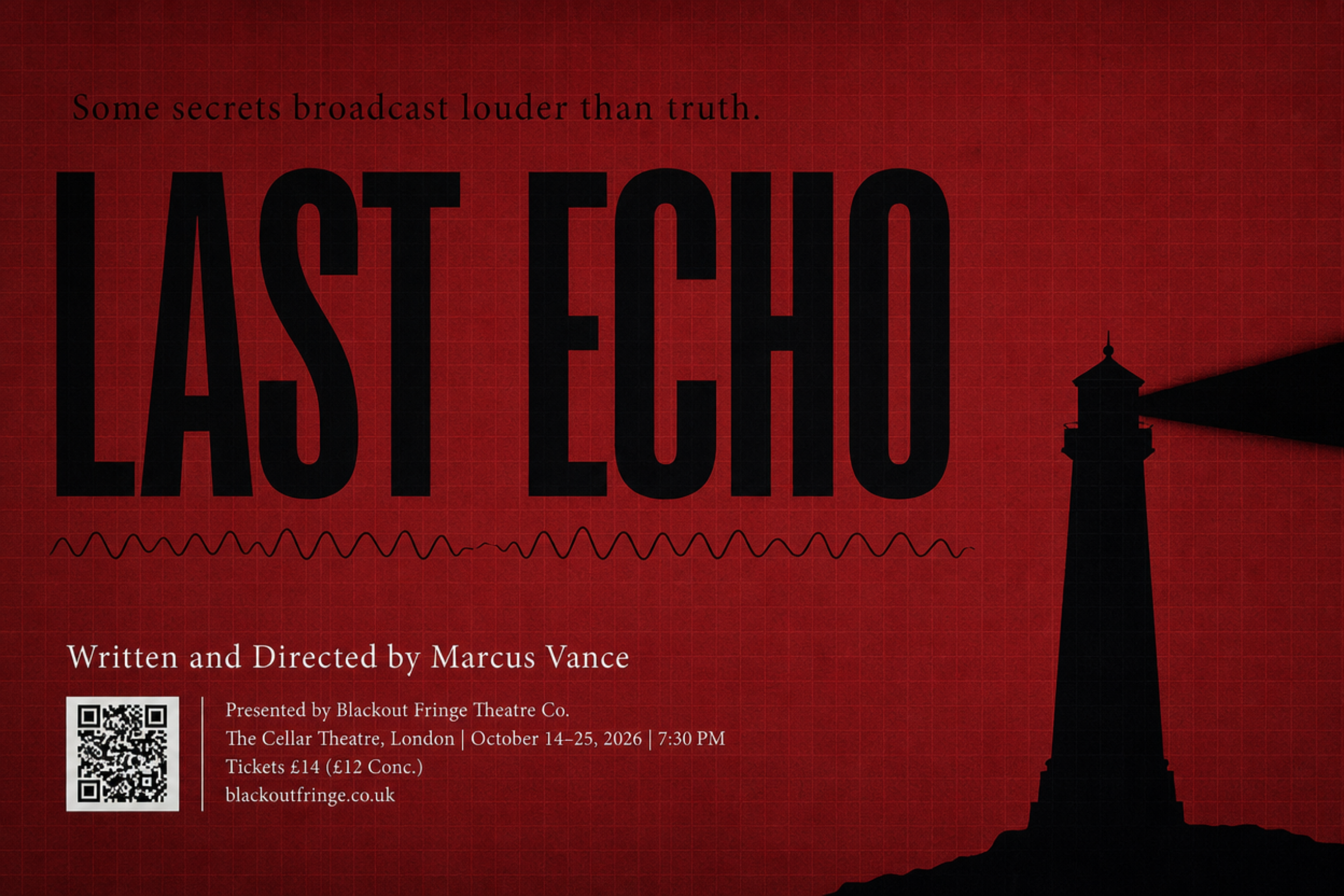
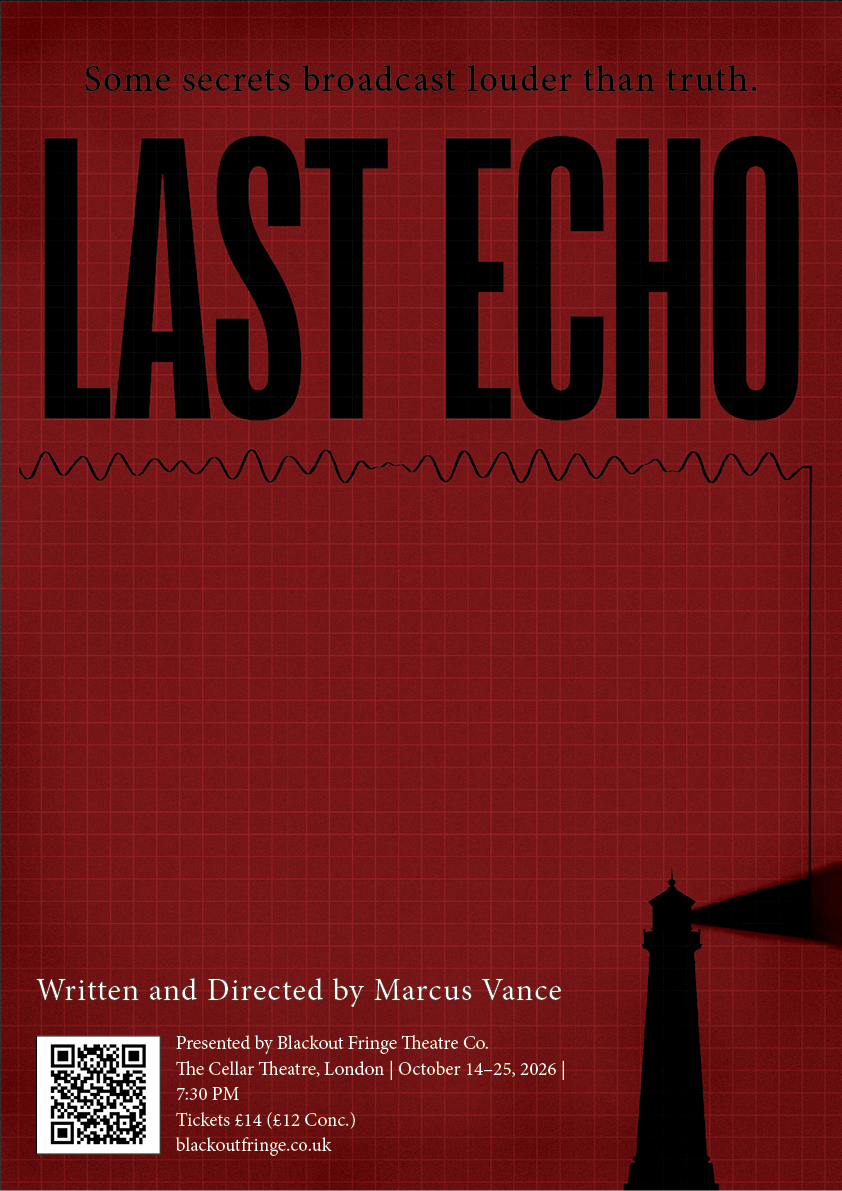
To practice foundational print layout, digital setup, and visual hierarchy under Stage 1 design guidelines, I created a self-initiated brief for Blackout Fringe Theatre Co. The goal was to design an A3 promotional poster and digital marketing assets for The Last Echo, a fictional psychological thriller premiering at The Cellar Theatre in London.
Mood board & Visual Research
I began by building a mood board around narrative motifs: 1970s audio equipment, radio sound waves, coastal lighthouses, fog, and claustrophobic textures. I also collected high-contrast, minimalist poster references to analyse how scale, negative space, and typographic hierarchy create suspense without relying on complex photographic compositing.
Concept & Colour Strategy
To immediately signal the thriller genre and evoke an eerie, unsettling atmosphere, I restricted the palette to a stark, high-contrast combination of deep red and black. The dark red background creates a visceral sense of dread and urgency, while the solid black graphical elements ground the composition.
Typographic Exploration & Vector Layout (Adobe Illustrator)
In Illustrator, I tested several condensed display fonts before selecting Reel for the main title, THE LAST ECHO. Its tall, compressed letterforms mimic the vertical architectural presence of a lighthouse, while its narrow counter-spaces build visual tension. From my mood board, I incorporated two core vector elements:
The Lighthouse: Positioned in the lower corner to ground the story in its isolated coastal setting.
The Sound Wave: Placed directly beneath the title to represent the mysterious radio broadcast at the heart of the plot.
Atmosphere, Texture & Supporting Details (Photoshop & InDesign)
Moving into Photoshop, I brought the layout to life with texture and mood:
The Grid Overlay: I added a subtle background grid, which introduces a structured, cage-like claustrophobia while emphasising the expansive negative space between elements.
Vignette & Fog: Using a soft brush around the borders, I darkened the edges to simulate encroaching coastal fog, drawing focus inward.
Supporting Typography (Minion Pro): For show details and venue copy, I selected Minion Pro. Its classic, refined serifs contrast nicely with the bold display title, providing excellent legibility when set with generous tracking and leading.