CTomGuitar
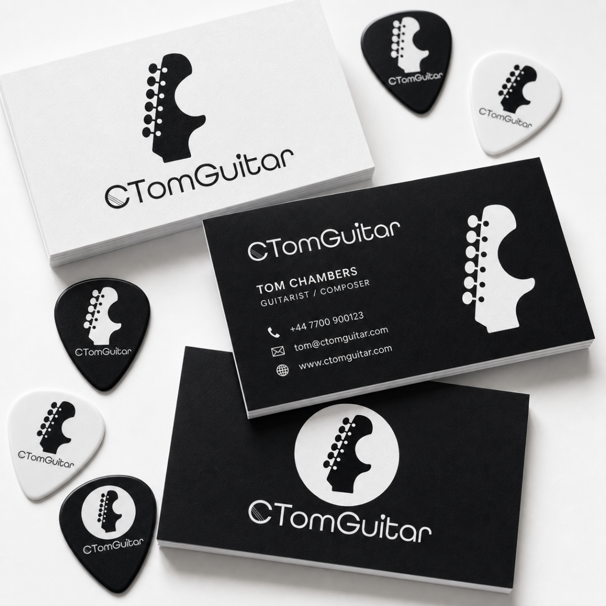
The Client & Brief: Charlie Thomas is a freelance guitar instructor and recording artist based in the UK. He needed a cohesive and fresh visual brand that could balance two distinct audiences. Primarily, the design had to be approachable for families seeking children's lessons and engaging for adults wanting to learn. Secondly, it needed a sophisticated, contemporary edge to support his career as a professional musician. The main challenge was integrating these requirements into a singular, flexible mark.
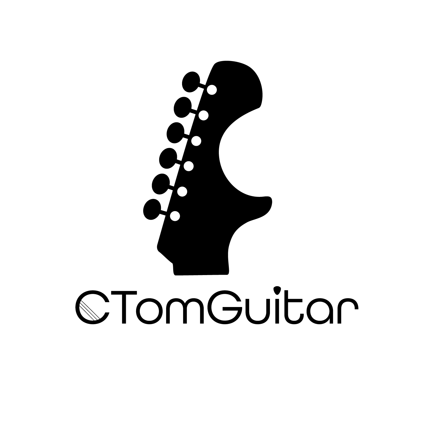
Design Evolution & Solution: My solution focused on a visual concept that would resonate with both audiences. By analysing the contours of a guitar, I identified a way to incorporate an instrument silhouette as a core branding element. Specifically, the characteristic curve on the headstock was a perfect stylistic and formal match for the capital letter 'C' in 'CTomGuitar'. This became the central anchor of the wordmark. Further refinement involved a subtle, integrated design that placed a guitar pick above the 'i' and used four horizontal lines as guitar strings on the cross-section of the C itself. These deliberate choices ensure the logo's purpose is instantly identifiable.
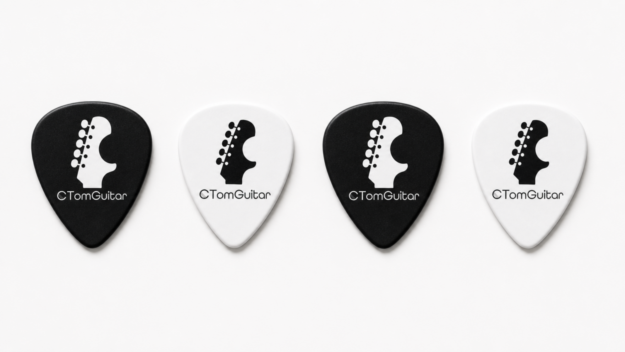
Typography & Colour: Given the logo's intricate graphical elements, I selected 'All Round Gothic' for the typeface. This clean, geometric sans-serif offers excellent legibility and a simple, friendly aesthetic. It provides a foundational clarity that prevents the logo from feeling overly busy or abstract. The decision to execute the brand in striking black and white was intentional to provide maximum versatility and sophistication. This high-contrast, minimalist approach gives the logo a sleek, modern, and mature finish suitable for any platform—from a business card to an album cover.
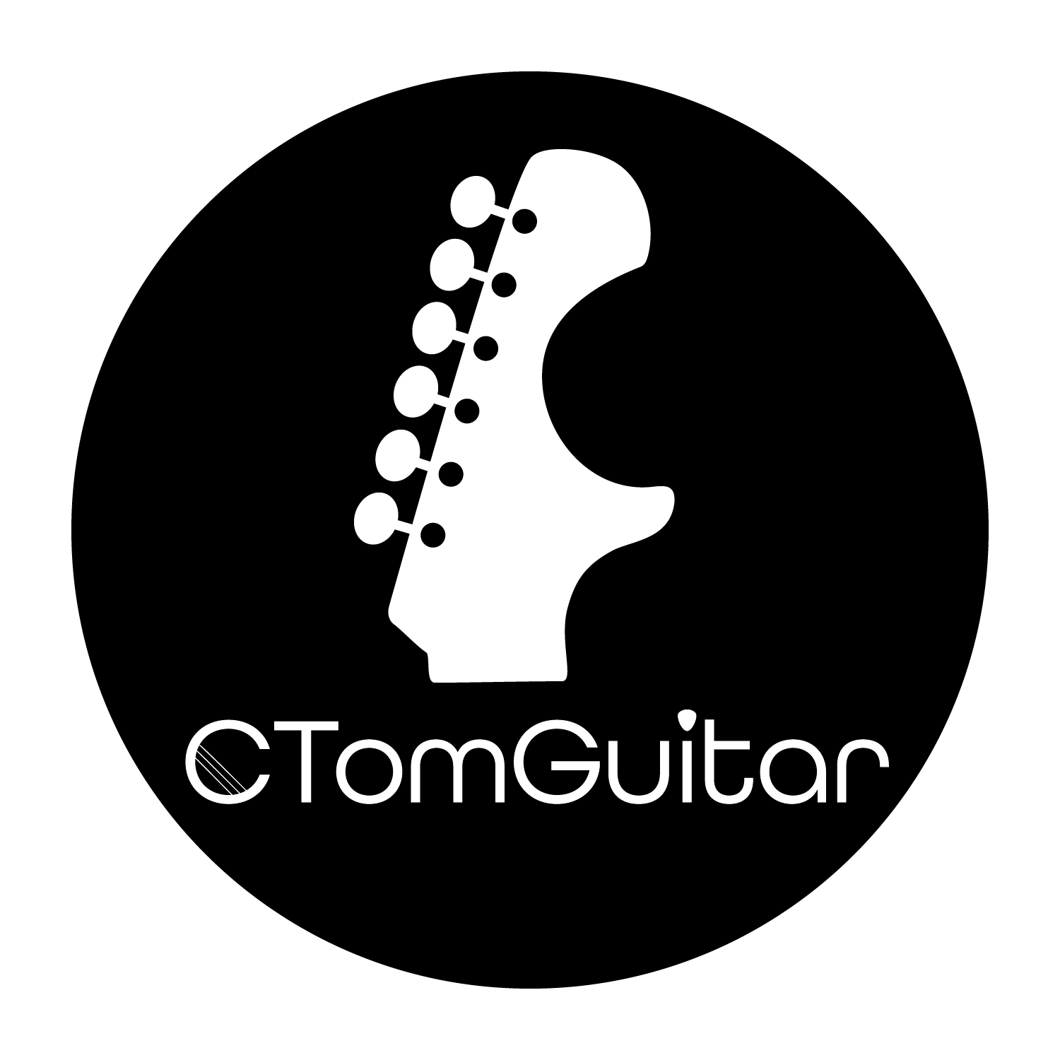
The Adaptation Strategy: The primary logo is horizontal, which is ideal for a header, but not optimal for circular profile picture formats. To ensure the brand remains powerful on social media platforms (such as Facebook and Instagram), I created a compact, vertically aligned adaptation.
Key Changes: The horizontal layout of the primary wordmark was restructured for better balance. To achieve this, I isolated the guitar headstock graphic and enlarged it significantly. I then centered this large visual element within a perfect circular frame. Below this prominent icon, I stacked the complete 'CTomGuitar' wordmark. For visual impact, I inverted the colors, placing white graphics on a deep black circular field. This adaptation makes the logo more powerful, maintains visual hierarchy, and ensures the brand is instantly recognizable, even at a small profile picture scale.